 |
Tuesday, 18 January 2011
Trick of the Eye
So i found this image quite a while ago and thought it was amazing, I will let you work it out ...
Ink Paintings
So here are two paintings which I did using the same materials ( ink and card ) but did them in using different methods. Another live model was posing with a few objects around him. So have a look.
 |
| This one is done using a pointy stick. |
 |
| This one was done using a wedge of card, with various sized adges. |
Monday, 17 January 2011
Natures Words
Well this is another task which we were given, which was to find organic objects to create a word which represented our course. In groups of two we created our words and well obviously ours was the best.


Clive the Crocodile
So one of the first thing we were told to do when we started uni was to make a giant paper animal in groups .... soo i'm a uni student. Was fun though and well our Crocodile totally kicked ass.


Japanese Stained Glass Tile
This was a side project I did, just to explore in to glass work. I created a glass tile with the theme of Japan and therefore created a Temple from different coloured glass, so here it is.
 |
| The Glass Tile before being melted together |
Paper Art
So in one of my art classes in Grays, we had to do a little project where we were given three different types of paper and with them we had re-create the image that was in front us. We had a live model pose with many differently shaped objects to create an interesting image. I went around this image by using each colour of paper to a different tone. I took the objects and kept there shape but just made them look as if they are portraying a different image. So by the time I finished I created a scene from King Kong, where the big Gorilla was replaced by a Ducks beak, the Empire State building was a Massive cone and the Distressed woman is looking up. Comment and tell me what you think.
 |
| The whole Image |
 |
| A silhouette of the woman |
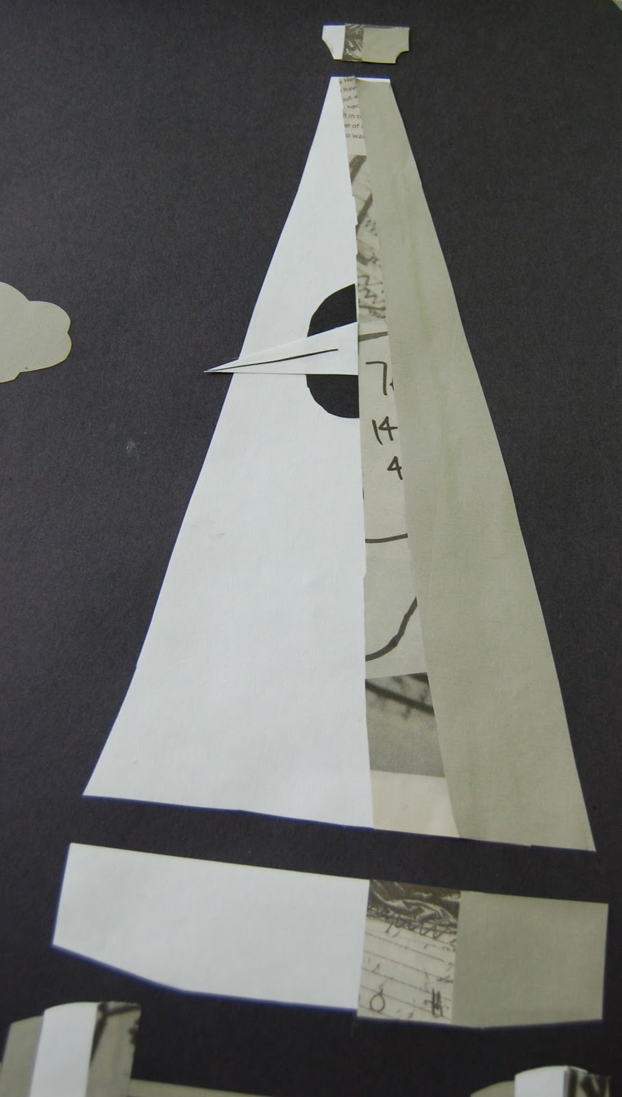 |
| The cone shaped "Empire State Building" |
 |
| The irony of the clouds and moon, with artificial lighting above it |
Public Seating with Lighting
So here is a design project of mine. I started of with the theme of modern age. After doing a lot of research, I found a few things which portray modern.
The few words I cut down to was:
- Silver
- Sleek
- Stylish
- Lighting
- Clean-Cut
- Clear Shapes
With this in mind I created this seating which is meant to be placed in a high business up town area where it would fit in with the surroundings. The chairs are clear and the rest of the structure is meant to be chrome therefore looking very 21st century. So have a look a comment.
 |
| Public Seating with Lighting |
Urban Decay
 |
| Urban Decay Painting |
Here is a painting of my idea of urban decay. It has been done in acrylic paint on card and well that's about it, check it out.
Sunday, 16 January 2011
Photography - Scottish Wildlife and Nature
So I decided to do a little Photography project. I set a theme of Scottish Wildlife and Nature and from there wanted to get fourteen images which I think capture this theme. I took these images with a Sony a200 D-SLR and considered many elements such as lighting, contrast, balance, highlights and shadows.


Julian Opie Style Image
This was a little side project i did in which i created another illustrated image of myself but instead this time i used the Julian Opie style.
Julian Opie's style was brought into the public eye when he was asked to design the cover for a compilation by British band Blur, Blur: The Best Of. On the cover, the band member Graham Coxon, Alex James, Dave Rowntree and Damon Albarn are transformed into Opie's style.
Julian Opie's style was brought into the public eye when he was asked to design the cover for a compilation by British band Blur, Blur: The Best Of. On the cover, the band member Graham Coxon, Alex James, Dave Rowntree and Damon Albarn are transformed into Opie's style.
 |
| Julian Opie's Work |
 |
| My Julian Opie Style Image |
Self Portrait
As you may have guessed this is another project called Self Portrait. This was not such a big project but was quite a fun one. I had to create a Self Portrait on Adobe Illustrator CS4. I basically had to make myself look like a cartoon. I had to show Highlights and Shadows in my image using similar tones. Check it out and tell me what you think.
 |
| Original Image |
 |
| Illustrated Image |
Introduce Yourself
Introduce Yourself. This was the next project I assigned. With this project, I had to create four Postcards which portrayed four aspects of my life. Each of the postcards was to be created on Photoshop CS4 and were required to be double sided with the back having a a piece of writing describing either your postcards or the specific one. I went around this project looking at four things which I felt were my life and without I would be in complete. Therefore my final idea involved the four main parts of my life, RELIGION, FAMILY, FRIENDS and EDUCATION. I then portrayed these in way in which they looked to me so have a look and feel free to comment.
 |
| 1st Postcard |
 |
| 2nd Postcard |
 |
| 3rd Postcard |
 |
| 4th Postcard |
 |
| The front of the Postcards altogether |
 |
| The back of the Postcards altogether |
Urban Alphabet
 |
| Urban Alphabet |
Subscribe to:
Comments (Atom)